Written by —

Written by —
For ease of reading, I have added a table of contents here in case you want to jump to a specific topic, like what Streamlit is, or see the examples.
- Importance of data visualization
- What are data applications
- What is Streamlit
- Why use Streamlit
- Streamlit is easy to setup
- Streamlit applications can be interactive
- Streamlit supports several data visualization elements
- Streamlit Deployment and Authentication
- Streamlit Development Process
- Streamlit vs. Gradio
- Juha Mieto - Importance of Correct Data Type (Writing data into Snowflake using Streamlit)
- Krista Pärmäkoski - Comparison charts
- Iivo Niskanen - Importance of Map Visualization
- FIS World Cup Ruka Nordic - Importance of Data Visualization in Sustainability Awareness
- Recap and look into the future of data applications
Importance of data visualization
I have always wondered how to explain the significance of data visualization. We stare at our spreadsheets, applications, and results from database clients and see the numbers on our laptop screens. We, humans, are visual beings but often are blinded by the data that we use and are thus incapable of explaining the importance of our data points to our coworkers, managers, and business representatives.
We, for instance, know that the now notorious Mars Climate Orbiter mission was doomed due to failure to translate English units to metric. A mistake that could have been seen far away if NASA had visualized, for example, in the style of the Kerbal Space Program, the Mars mission on test simulations and spotted the landing speed data misrepresentation. That's a tangible example of a mistake caused by false data interpretation, but it doesn't cause feelings in us. It's not easy to relate to a robot smashing into the surface of Mars, 'cause ultimately you know that Nasa can fix the problem in the future (and fix it they did with the Opportunity mission lasting over 15 years on Mars).
We Finns need something more tangible to feel, and oh boy, have I got a perfect example of why seconds matter.
Juha Mieto and Thomas Wassberg, Cross Country Skiing 15km, Lake Placid 1980
We'll revisit this event on Lake Placid with Juha Mieto later in this blog, as it had concrete implications on how time is measured at winter sports competitions. Before that, let's dive into what Streamlit is, what data applications are, and how Snowflake-acquired Streamlit can help you to visualize your data. Later in this blog, I'll use the merits of a few known winter sports athletes and the context of winter sports as an example of how Streamlit can visualize various data points. From there, I'll continue by showing how data visualization can help to picture the problem ahead for all winter sports - climate change.
Let's begin by examining the concept of data application and how, for instance, they are a vital part of the data analysis and experimentation part of the Machine Learning workflow.
What are data applications?
Data applications or data apps, in short, are an umbrella term for a category of tools that deliver insight into existing data or allow you to input or modify existing data using lightweight UI within your web browser. Data applications differ from embedded analytics in the way they are used and the level of analytical capabilities they provide.
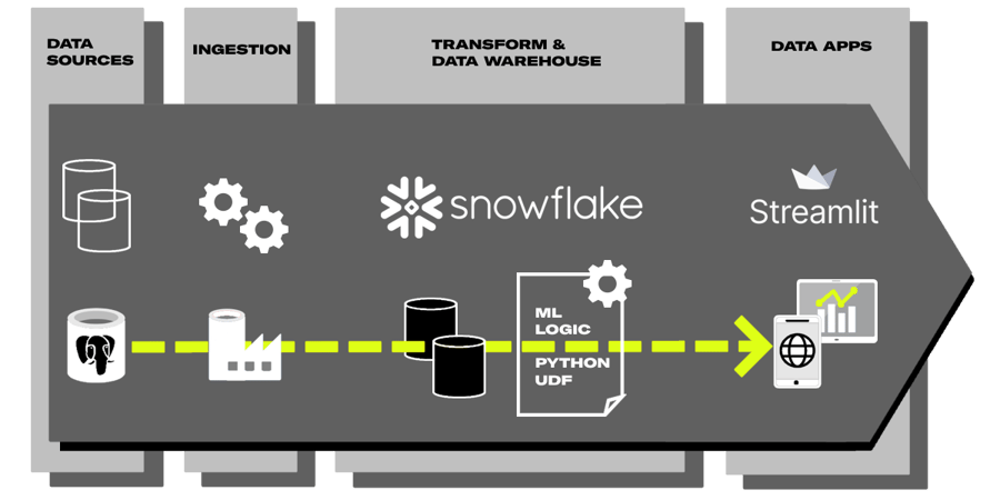
Example Modern Data Stack -architecture where Streamlit is used to provide mobile and web app to end user
Embedded analytics are typically integrated into other applications or platforms and provide users with more convenient access to data insights and static dashboards. Whereas data apps are standalone tools used by technical users to perform more advanced data analysis tasks and tend to be highly customized, dynamic, and purpose-built.
The big difference between traditional reporting, embedded analytics, and data apps is how easily data apps can create interactivity with the ability to write data back into the backend database. This allows data engineers and ML engineers within the existing data team to create applications where the business user, for example, can test how Q1 sales prediction would play in his parameters or an application where the user can choose the best possible prediction model for energy consumption for the upcoming week.
This doesn't mean that data applications couldn't, for example, replace traditional reporting in some use cases. Traditionally BI tools have been tied to user licenses and come with a cost factor. Rarely used lightweight reporting needs could be easily replaced with open-source data applications and used to save money.
Why haven't we heard of data applications before if they are so groundbreaking? Don't these belong to the same group as Microsoft PowerApps or low-code applications? Yes and no. The trend now around data apps is driven by the popularity and versatility of the Python programming language, and when I speak of data apps, I mean the ones based on open-source Python -libraries.
Python is a popular programming language that is widely used in data science and machine learning as Python has a variety of libraries designed for data analysis and visualization, such as NumPy, Pandas, SciPy, and Matplotlib. Data apps come especially into play when data science and machine learning models need a user interface to allow users to interact with the code. This is most common with Machine Learning. Machine Learning Engineers and data scientists need to build apps for internal demos and external consumption to showcase their models in various ways.
For example, the video below demonstrates a small application where I can trigger the Python UDF inside Snowflake (which I created to predict the outcome of FIFA World Cup games -- image is a link to the original post) and get the result into the application.
 Build Machine Learning Pipeline with Snowflake, dbt, Snowpark and Python UDFs to predict FIFA World CUP winner 2022
I created the application in one evening, and most of the time was spent on custom visualization. The key thing to understand here is the speed and ease of development. I had some experience in Python, but none with Streamlit, and I managed to create a web application even though I didn't have any front-end experience (nor I had to have, one because of the ease of Streamlit -library).
Streamlit application used to trigger Python UDF containing trained Poisson-model of FIFA games
Another example of this is the interface used in Stable Diffusion models. Most Colabs use the Gradio data app for users to test their trained model. The data app offers all the essential options and radio buttons for the user to choose the correct samplers and visualize the outcome based on your given text input.
Previously creating the interface for testing the ML model would have been a sluggish process requiring the ML Engineer to understand front-end development frameworks like React and Flask (or ML Engineer or data scientist to co-work with the Front-End Developer).
This has now changed because popular data application frameworks (Streamlit, Gradio, Flask, and Dash) have changed the game as they are Python libraries that can be used with a few commands within the existing data science or ML code script. These Python libraries abstract technologies and protocols required to build a full-stack web app and enable you to create a user interface within minutes. These we call data apps, and even though I'm showing only visualization examples on this blog, they can be much more. Data applications can help people to access data in the format they hoped for (instead of reading data from a database into massive Excel -application with filters and VLOOKUPS and such).
What is Streamlit?
Streamlit is one of the most popular open-source Python libraries that allow you to create interactive web-based applications, particularly for data visualization and machine learning. It enables you to build apps quickly and easily by writing simple Python scripts and automatically converting them into a web application that can be shared with others. Streamlit has gained popularity within a few years since the open-source project launched in 2019.
In March 2022, Snowflake acquired Streamlit cementing Streamlit's role as one of the leading Python libraries in creating interactive data applications. The integration between Snowflake and Streamlit has gotten deeper as Snowflake has helped Streamlit to integrate more easily into the data within Snowflake for instance by adding the support of Snowpark data frames. The next evolution will be the ability to create Streamlit applications within Snowsight as demonstrated in the video below.
Sneak Peek for the upcoming Streamlit integration to Snowflake Snowsight
Snowflake has a bigger story of native applications where Streamlit plays the part of application visualization and interactivity. This means that investing knowledge now into Streamlit will benefit in the future when data applications and data products will be the de-facto requirement for any data platform.
Why use Streamlit?
Traditionally writing an application with front-end capabilities would include several techniques and frameworks like React or Angular for user interface and handling the client-side logic. On top of this, you would add CSS -frameworks such as Bootstrap or Foundation for the look and feel across devices. These languages provide a multitude of options, but they are complex to start for simple use cases. Creating a simple slider function using React is done with the following code.
<Stack spacing={2} direction="row" sx= alignItems="center"><VolumeDown /><Slider aria-label="Volume" value={value} onChange={handleChange} /><VolumeUp /></Stack><Slider disabled defaultValue={30} aria-label="Disabled slider" />
While the same can be accomplished using Streamlit with the following code, albeit with more limited functionality. This code example excludes a lot from React side for the visualization, so the difference is even bigger.
volume = st.slider("Volume:", 0.0, 100.0, (25.0, 75.0))
This code summarises why data-oriented developers are starting to use Streamlit. Creating a simple functionality is easy and fast. Streamlit automatically handles many of the complexities of building web applications such as handling browser interactions, state management, and data visualization that's normally part of the React -code that's written by the developer. This allows Streamlit -developers to focus on the logic and functionality of their application rather than the underlying infrastructure.
Easiness and fastness don't mean that Streamlit wouldn't have the necessary tools to create fully-fledged applications. Using Streamlit, you can create a variety of interactive app components, including plots, graphs, maps, tables, and more. You can also add interactive elements such as sliders, buttons, and text inputs to allow users to interact with your app. To further soothe the application development, Streamlit supports additional Python frameworks such as scikit-learn, spaCy, Pandas, and various other visualization frameworks like Altair, Plotly, and Matplotlib.
With these components you can build a fully-fledged data application, as Carlos Carrero has demonstrated in his blog, to train and test out different ML classification models inside Snowflake, where the user inputs are given by using Streamlit UI.
Streamlit application showcasing Snowpark ML classification models
The roadmap of Streamlit looks also really promising. Within 2023, Streamlit will get Python 3.11 support, the ability to nest columns within columns, editable and selectable data frames where users can add and delete rows, do events based on data frame selections, and filter, aggregate, sort, etc. on a data frame (and thus enabling Excel and Google Sheets like features, but with database backend), selection events on charts and clicks and selections on maps and better support for connections. With these improvements, creating a more interactive application will become easier than before.
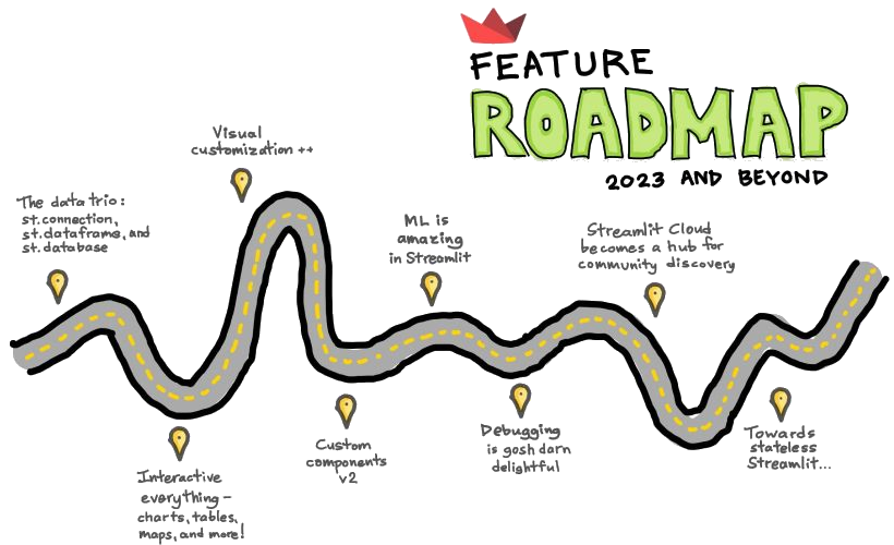 Feature roadmap for Streamlit - Image is taken from streamlit.io
Later in this blog, I'll show more data visualization examples and demonstrate how easily you create a simple application with just a few lines of code.
STREAMLIT IS EASY TO SETUP
Streamlit applications are designed to be easy to use and require minimal setup. You can create a Streamlit app by writing simple Python scripts, and Streamlit will automatically convert them into a web application. This makes it easy for users familiar with Python to build interactive apps without learning complex web development frameworks.
For example, the following code creates a web application that includes a table element from a data frame that can be hosted within a web browser or embedded into an existing webpage using IFrames in minutes. No extra layer of code is needed for the front end.
Simple Streamlit application showing random numbers provided by numpy
Streamlit applications can be interactive
Streamlit applications allow users to add interactive elements, such as sliders, buttons, and text inputs to their apps. This enables users to interact with the app and thus explore the data more dynamically.
Adding sliders, for instance, can be accomplished with only a few lines of code, like the snippet below.
import streamlit as stfrom datetime import timeappointment = st.slider(
"Schedule your appointment:",value=(time(11, 30), time(12, 45)))
st.write("You're scheduled for:", appointment)
Simple Streamlit application showing slider functionalities
Streamlit supports several data visualization elements
Streamlit includes a range of built-in data visualization tools that allow users to easily create plots, graphs, maps, and other visualizations. This can be particularly useful for data scientists and machine learning engineers who need to explore and communicate data-driven insights.
Displaying a matplotlib figure can be achieved with the following code. The slider is added for animation purposes.
import streamlit as stimport matplotlib.pyplot as pltimport numpy as np
x = st.slider('Select a range of values',0, 100, (25, 75))arr = np.random.normal(1, 1, size=x)
fig, ax = plt.subplots()
ax.hist(arr, bins=20)
st.pyplot(fig)
Simple Streamlit application showing Matplotlib library functionalities
STREAMLIT DEPLOYMENT AND AUTHENTICATION
Streamlit does not provide a runtime environment on its own, but it can be used to create web applications that can be run basically on any cloud. Streamlit applications can be easily shared with others by packaging the application code and dependencies into a docker container image, and then deploying the container to a virtual machine, Azure App Service, or AWS App Runner.
Once deployed, the application will run inside the container (or similar cloud service) and can be accessed via a web browser by anyone with the URL or by using multiple ways of authentication starting from their own authenticator, with AWS Cognito and Azure AD. Another easy way to share Streamlit applications is to share the underlying Python code together with the list of dependent libraries. This makes it easy for users to collaborate and communicate around data analysis and insights.
STREAMLIT DEVELOPMENT PROCESS
When developing with Streamlit, you need to have Python installed on your machine to execute the Python script and the Streamlit library. Once your script is executed, Streamlit will automatically start a local web server and launch a web browser with your application running in it. When you make a change to your code, you can just refresh the application in your browser to see the changes without having to stop and restart the script. This is possible due to a feature called "hot-reloading" and is enabled by default when you run the streamlit run command.
Additionally, Streamlit has a built-in mechanism for caching data, which is useful when running machine learning models or loading large data sets. This caching system avoids running the same code multiple times, which is useful when developing and testing your application.
Streamlit vs Gradio
If you have heard about Streamlit, you have probably stumbled upon another great Python library; Gradio, and might be wondering what's the difference between Gradio and Streamlit. Like Streamlit, Gradio is a Python library used to build interactive web-based applications for data visualization and machine learning. Like Streamlit, Gradio is also designed to be easy to use and allow users to create interactive apps quickly and easily by writing simple Python scripts. There are a few differences between Streamlit and Gradio, which I have narrowed down into Focus, Features, and Extensibility topics and opened up these topics a little further to help you to differentiate the products.
Focus
Streamlit is a general-purpose library for building interactive web-based applications in Python, while Gradio is specifically designed for creating interactive user interfaces (UI) for machine learning models.
Features
Streamlit includes a wide range of features for building interactive web-based applications, including tools for data visualization, machine learning, and more. Gradio is primarily focused on helping on building interactive UIs for machine learning models and includes features for inputting data, viewing predictions, and exploring model behavior.
Extensibility
Both Streamlit and Gradio are designed to be extensible, allowing users to add custom components and functionality to their apps. However, Gradio includes additional features for building custom UIs for machine learning models, such as the ability to specify custom input and output types.
So both Streamlit and Gradio provide excellent, easy-to-use tools to build interactive web-based applications in Python, but if you are leaning towards complex machine-learning models and UIs, Gradio might be your choice.
Now that we are familiar with data applications and Streamlit, let's explore how easy it's to set up a data application and use it to visualize your story. As promised, let's get back to the event in Lake Placid in 1980.
Juha Mieto - Importance of Correct the Data Type (Writing data into Snowflake using Streamlit)
The difference between 41:57.63 and 41:57.64 might not look like much, but for Juha Mieto, that was the difference of how much faster Thomas Wassberg was in 1980 games at Lake Placid in the 15 km classic sprint – Mieto lost by 1/100th of a second. 
After the extremely close finish, the International Ski Federation (FIS) ruled that from that point on all cross-country times would be measured to the nearest tenth of a second. The change was considered for the better in cross-country skiing, but for analytical purposes in databases, this would have been the opposite.
In databases, we have several data types for storing numeric values, such as REAL, FLOAT, DOUBLE, and INTEGER, and from these, you should question why you chose a floating-point number to store data. Floating-point arithmetic was used to save memory when we lacked the needed computing and storage. Floats gave us a versatile way of doing calculations that involved large numbers, but they sacrificed accuracy. Floats are approximations and cannot accurately represent all real numbers and cannot accurately handle all arithmetical operations. With floats, this inaccuracy eventually leads to rounding errors, which we do not want in real life (but in Juha's situation, we hoped for). The lesson here is to choose DECIMAL/NUMERIC data types whenever possible, even if it might hurt you someday in real life.
 The change has been in favor of the Finns, at least once, as in Winter Olympics 2018 at Pyeongchang, Krista Pärmäkoski won bronze with Marit Björgen when they both finished at 25:32.40 on the 10 km freestyle cross-country skiing competition.
This whole topic might sound boring, but I'll show you how storing data in incorrect datatype, loses information. For this use case, I'll show how easy it is to create a Streamlit -application where you can write data back to Snowflake -table with only a few commands using the built-in Snowpark data frame write -command. The example creates a completely new table if desired or can overwrite an existing table. If we would update or merge existing table columns using DataFrame information, we could accomplish that with the snowflake.snowpark. table-level API -commands.
import streamlit as stfrom snowflake.snowpark import Session
# Snowflake settings# Create connection stringconnection_parameters = {"account": '******.west-europe.azure' ,
"user": '********' ,
"password": '********' ,
"role": '**********' ,
"warehouse": '*********' ,
"database": '*********' ,
"schema": 'DATA'
}
# Create Snowflake connectionsession = Session.builder.configs(connection_parameters).create()df = session.sql("SELECT name, point_1, point_2, final FROM COALESCE_DEV.DATA.LAKE_PLACID_RESULTS")df2 = session.sql("SELECT name, point_1, point_2, final FROM COALESCE_DEV.DATA.LAKE_PLACID_RESULTS_2")df3 = session.sql("SELECT name, point_1, point_2, final FROM COALESCE_DEV.DATA.LAKE_PLACID_RESULTS_3")col1, col2 = st.columns(2)x = st.select_slider('Select datatype accuracy', options=['TIME(9)', 'TIME(1)', 'TIME(0)'])with col1:table = st.text_input('New table name', 'LAKE_PLACID_RESULTS_NEW')with col2:st.header(" ")if x=="TIME(9)" and st.button('Write to Snowflake'):df.write.mode("overwrite").save_as_table(table)elif x=="TIME(1)" and st.button('Write to Snowflake'):df2.write.mode("overwrite").save_as_table(table)elif x=="TIME(0)" and st.button('Write to Snowflake'):df3.write.mode("overwrite").save_as_table(table)if x=="TIME(9)":st.write(df)elif x=="TIME(1)":st.write(df2)elif x=="TIME(0)":st.write(df3)
Simple Streamlit application showing the ease of writing data into Snowflake
Besides having to be in perfect mental condition and able to tolerate even tight losses (Mieto took the loss like a champ and declined to split the gold medal even though Wassberg offered that), an athlete must also be in excellent physical condition. The results of any physical tests are usually kept hidden, but one athlete has been outspoken about hers. Let's look at how easy it's to visualize the superior physical condition of one Finnish female cross-country skier using Streamlit.
Krista Pärmäkoski - Comparison charts
The difference in general physical condition between ordinary people and athletes is something that we can grasp within our minds. The contrast between athletes and professional sportsperson is a bit more challenging to differentiate. If we set aside the confirmed results from sports competitions and practices, the physical condition is harder to show in a single data point to be used as a comparison to an athlete or yourself.

For this purpose, at least for endurance athletes and sportspersons, we have the maximum oxygen uptake or VO2 max test. VO2 max is considered an ideal measure of physical fitness because it reflects the body's ability to use oxygen to produce energy during intense exercise. Higher VO2 max values are generally associated with better physical fitness and are often seen in athletes and other highly active individuals. This means that the VO2 max test can be used to distinguish between casual athletes and sports people by measuring their aerobic endurance and cardiovascular fitness.
Krista Pärmäkoski is a superb example of an athlete with outstanding physical fitness. At the age of 15, Krista already had a VO2 Max value of 69 ml/kg/min, which is at the same level as an adult athlete in his peak physical condition, and Krista's values are still at the same level now when she is in her 30s. Her excellent physical condition has helped her to win medals at the highest FIS (two silver and five bronze medals) and Olympic-level competitions (two silver and three bronze medals). If the number 69ml/kg/min doesn't inform you anything, you are not the only one.
The best way to illustrate how good number the 69ml/kg/min is, we can create a bubble chart using plotly.express to express the difference between regular people's and athletes' VO2 max test values and simultaneously showcase how easy it is to use additional Python libraries if Streamlit doesn't have the required built-in graphical tool elements. 
Bubble charts are graphs that use circles, or "bubbles," to illustrate data points. Each bubble portrays a different data point, with the size representing the third dimension of data. Bubble charts are a good choice for comparison because they can effectively show the relative size of each data point, even when the values being compared are significantly different (in this case, the VO2 max values). This is because the size of the bubbles can be used to represent the magnitude of the values, allowing users to see which data points are larger or smaller relative to one another.
import streamlit as st
import plotly.graph_objects as go
fig = go.Figure(data=[go.Scatter(x=["Normal person", "Athlete", "Krista Parmakoski"],y=[28, 46, 69],mode='markers',marker=dict(color=[15, 30, 45, 60, 75, 90],size=[15, 30, 90],showscale=True))])st.plotly_chart(fig, theme="streamlit", use_container_width=True)
Simple Streamlit application showing additional libraries functionalities, e.g. plotly
As the bubbles show, it's easy to show the comparison of data when it's pictured using appropriate methods. From bubbles, we can move into maps. Athletes compete around the globe, and sometimes it's challenging for us to comprehend how much they must travel. Let's inspect how the FIS competitions are located on the world map and how FIS is attempting to make them more sustainable.
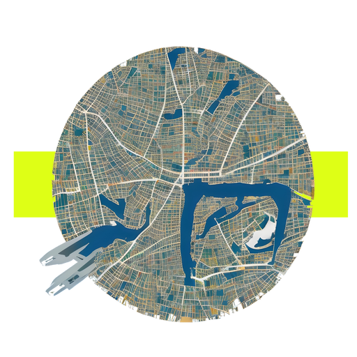
Iivo Niskanen - Importance of Map Visualization
Iivo Niskanen is a cross-country skier from Finland. He is a two-time Olympic medalist, winning gold in the team sprint at the 2014 Sochi Olympics and bronze in the individual sprint at the 2018 Pyeongchang Olympics. Niskanen is considered one of the best sprinters in the world and has multiple World Cup wins and podiums, but even he is not immune to stress caused by traveling between competition locations. During the cross-country skiing season, there might be nearly 17 locations around the globe, like in season 2018-19, where an athlete must attend if they want to compete for all the possible FIS points. This means a lot of traveling even though most FIS competitions are held in Europe. This year, 2022-23, the number of locations where Iivo was destined to participate was 15.
The best way to illustrate where Iivo must travel is to use maps. With Streamlit and Snowflake -connection, we can embed a simple world map showing the locations of FIS Cross Country competitions cities in 2022-23 by using only a few lines of code. The following code shows here how easy it's to set up a Snowflake connection to Streamlit -application.
 This rudimentary map with a Snowflake connection here is used without a credential -file to demonstrate how easily the map is created from latitude and longitude coordinates coming from Snowflake -table.
The connection creation doesn't also require any further steps. FIS Competition data is loaded from Snowflake into a data frame and passed to the st.map -function, which itself is a wrapper around the st.pydeck_chart -function. If we would like to use layers or show a more complex presentation of the map, we could use directly the st.pydeck_chart offering more configuration possibilities.
import streamlit as stfrom snowflake.snowpark import Session
# Snowflake settings# Create connection string
connection_parameters = {"account": '******.west-europe.azure' ,
"user": '********' ,
"password": '********' ,
"role": '**********' ,
"warehouse": '*********' ,
"database": '*********' ,
"schema": 'DATA'
}
# Create Snowflake connectionsession = Session.builder.configs(connection_parameters).create()
chart_data = session.sql("SELECT lat, lon FROM COALESCE_DEV.DATA.FIS_CITIES").toPandas()
chart_data.columns=chart_data.columns.str.lower()st.map(chart_data)
Simple Streamlit application showing st.map functionalities with Snowflake connection
What the map doesn't show, is the time frame of competitions. We could add this information by adding a slider or by creating a filter with st.selectbox or st.date_range and showing only cities within a certain competition block. The filters would show that FIS is doing something
This map shows that competitions are held nowadays in groups to avoid unnecessary traveling during the season and thus creating the competition more sustainable for the environment and for the whole competition crew by enabling more time for the athletes to recover.
Why maps are also important for creating more sustainable routes for the athletes participating in FIS competitions?
Maps can help to identify the most efficient routes
Maps can be used to identify the most direct or efficient routes between two points, taking into account factors such as distance, terrain, and the availability of transportation options. This can be particularly useful for finding sustainable routes that minimize the environmental impact of transportation.
Maps can help to identify alternative modes of transportation
Maps can be used to identify the availability of alternative modes of transportation, such as public transit, biking, or walking. This can be helpful for finding more sustainable routes that rely on modes of transportation with lower carbon emissions.
Maps can help to understand the spatial context of a region
Understanding the spatial context of a region can be important for finding sustainable routes that take into account the local environment and resources. For example, a map might show the location of natural habitats or sensitive areas that should be avoided or the availability of charging stations for electric vehicles.
Why should we care about maps or sustainability? Every one of us might have noticed news this winter that the Alps have faced an unseasonably warm winter and this has caused situations where winter competitions have been held in cities where there isn't snow at all. As the final example on this blog, let's look into how we can use Streamlit data visualization to raise awareness of the climate situation.
FIS World Cup Ruka Nordic - Importance of Data Visualization in Sustainability Awareness
The situation at the FIS Alpine Skiing World Cup paints a bleak picture ahead for the FIS Cross-Country Skiing competitions if no immediate actions are taken. Due to high temperatures, lack of snow, and bad weather conditions, FIS has already had to cancel races, and the situation has had them already considering moving the start of the season later into the season and removing the competitions from October and November. The lack of snow is already raising its head in Finland. FIS World Cup has been held at Ruka Nordic since 2010-2011 and is usually the first of or the second World Cup race of the season. This means that the race is most likely held in late November when there has been snow in Ruka, but in 2022, the competition was managed to pull off with pre-made snow. This isn't the first time this has happened. The same tragic situation was witnessed in 2018. 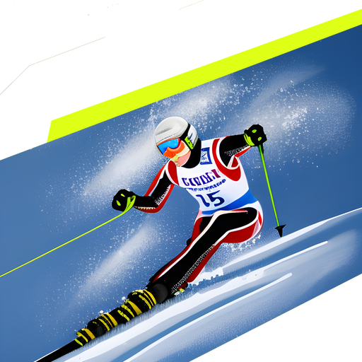
What usually happens with these phenomena is that people forget what happened last year. This happens every winter or summer. Last year was always better and no one remembers what happened three years ago. This is why automated data charts are good at visualizing what's happening to the climate and creating more awareness of the situation where we are now. The following Streamlit chart shows that you can dual axis charts with ease using additional Streamlit -libraries for more complex visualizations, Vega-Lite in this case. This chart shows the amount of snow at Ruka year-by-year using data from a local Finnish weather station.
import streamlit as stimport pandas as pd
data ={'Year':[2003,2004,2005,2006,2007,2008,2009,2010,2011,2012,2013,2014,2015,2016,2017,2018,2019,2020,2021,2022],'Temp':[0.5, -23.8, -6.6, 3.4, -14.9, -3.1, -0.1, -22.7, -3.3, -17.6, -12.3, -4.3, 0.6, -9.4, -1.6, -5.9, -10.9, -9, -22.8, -7.5],'Snow':[14, 12, 5, 9, 20, 20, 22, 6, 6, 11, 38, 15, 13, 15, 18, 2, 36, 21, 13, 7]}chart_data = pd.DataFrame(data)st.vega_lite_chart(chart_data,{"title": {"text": "Snow amount at Ruka","fontSize": "20","color": "85A9C5"},"width": 600, "height": 400,"encoding": {"x": {"field": "Year"},},"layer": [{"mark": {"opacity": 0.9, "type": "line", "color": "#0047AB"},"encoding": {"y": {"field": "Temp","title": "Temperature (°C)","axis": {"titleColor": "#0047AB"},"sort": "descending"}}},{"mark": {"type": "rect", "tooltip": "Snow amount", "fillOpacity": 0.5},"encoding": {"y": {"field": "Snow","title": "Snow (cm)","axis": {"titleColor":"#85A9C5"},"sort": "descending"},"y2": {"value": 310}}}],"resolve": {"scale": {"y": "independent"}}})
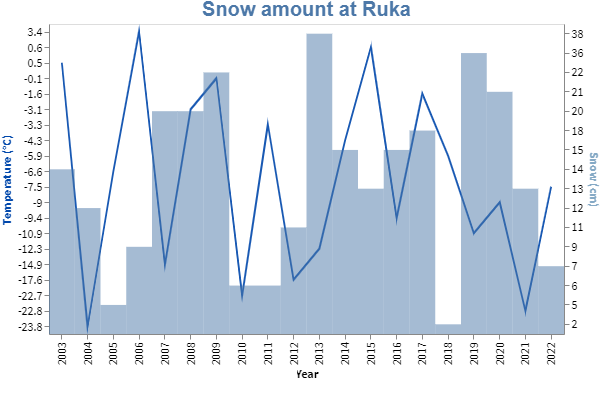 Screen capture from Streamlit application showing st.vega_lite_chart functionalities
You can see that the amount of snow has declined heavily in 2018 and 2022. This might sound like over-aggregation, but without any further action, we are headed to the same route as in the Alps and Alpine skiing competitions. What we can do is start using data more and create, for example, solutions that can help us to optimize the existing travel routes or manufacturing processes.
Travel routes are only one factor that could be optimized. There is a big opportunity for electricity and manufacturing process optimization where data could be used to fasten the process. Machine Learning capabilities and scalable compute power, like the ones Snowflake provides, are enabling more use cases that were previously impossible due to scalability issues.
That has now changed. You can now create fully fledged ML pipelines for calculating process optimization using Snowflake and then use Streamlit applications to help the visualization process or by using them as application front ends for the Machine Learning algorithms enabling the optimization. By doing so, we can make our living more sustainable and allow us still to enjoy winter sports without compromising nature.
Recap and look into the future of data applications
In recap, data applications are usually created by the data team using existing data visualization affiliated Python library frameworks to provide more insight into their data and thus can be more complex than traditional embedded analytics. Data applications might provide more interactivity by enabling the user to write inputs to the database or help to test your team's latest ML model straightforwardly.
Streamlit is one the now popular data application libraries and can be taken into use with few commands. Streamlit's success has been due to its easy setup and support for multiple existing Python libraries. Since its acquisition by Snowflake, Streamlit has gotten more Snowflake support, like reading the data directly from Snowpark data frames and better authentication methods.
Data applications will continue to evolve as the demand for more complex applications rises and thus require more Python-based Machine Learning capabilities. Data teams will not have the time to create complex frontend code in the future, meaning that libraries or tools speeding up the development of applications will continue to gain more ground. The interest in data applications will probably rise with the existing demand for MLOps and because of the looming possibilities of Large Language Models (LLMs).
Enjoyed the article? For this blog, we have used tools like Streamlit for building the showcase applications, Blender for video editing, trained images of Krista Pärmäkoski, Iivo Niskanen, and Juha Mieto using StableDiffusion and modified the images together using Paint+ (yep, really). At Recordly you are free to any tools necessary for expanding your knowledge and opening your creative freedom.
IWe are constantly looking for Data engineers and Data Architects to join our kick-ass bunch of data troops! Read more about us and apply👇

And lastly, if you're curious to stay tuned with our publications, subscribe below: